
Roche Genentech PHC Portal
UX and Visual Design for a Personalized Healthcare Portal website
goals
1. Establish a common language
2. Alignment on creative direction
3. Distill tribal knowledge
4. Define intersecting user needs
5. Define “tuning forks” for decision-making criteria
6. Translate all of the above into a design strategy
overview
• Design and build a web portal for Roche-Genentech: the first stop
• Communicate company vision - What is PHC at Roche?
• Inspire, drive, and motivate action - share, communicate, contribute
• Speak from a voice of authority
• Maintain an approachable spirit
Target Users: Connect 94K Roche employees, worldwide.
Team:
4 Developers, 2 UX Designers, 1 Product Manager, 2 Strategy and Communication leads
Role:
UX Designer, Visual Designer, Illustrator, Creative Workshop planner/facilitator
Key User Moments (vs. Personas)
Meeting the users where they are when they visit the portal; we decided to use these POVs, or moments, vs. building out Personas because it was more relevant to how the portal would be used.
These moments helped us understand how to best serve complex user needs, answering the “how might we?” questions for all relevant starting points. This foundation also helped us distill where users would have intersecting needs.
Connection – Creates Value and Meaning
- “I need access to information and people who can help me solve the problems we face in our market.”
- “I learned about the strategic importance of PHC at Roche through a networking event, and want to get involved so I can become a leader at Roche.”
Inspiration to Action – Visual Beacon + Vocabulary
- “I need my stakeholders to be able to understand and embrace the full impact of the PHC and connect with each other.”
- “I saw something on a workspace related to PHC that might be relevant to my work.”
Approachable + Authoritative – Aligns with Brand Voice
- “I was directed to the PHC Portal in my onboarding to learn about PHC as an important aspect of Roche’s strategy.”
- “My team wants to utilize a new capability and I was asked by my executive to show how it’s been used before and its value.”
Deliverables
The team designed and built:
- A library of pages for the portal to meet the intersecting needs of Roche employees. Pages: Landing/Home, Article, Events, Capabilities, and Impact.
- A Publishing and Management system that was more intuitive and robust than the one previously implemented.
- Improved search functionality and discoverability of content.
- Collaborated with the internal team on the design and content of error modals and narrative illustrations, which required the distillation of an overarching Personalized Healthcare message.
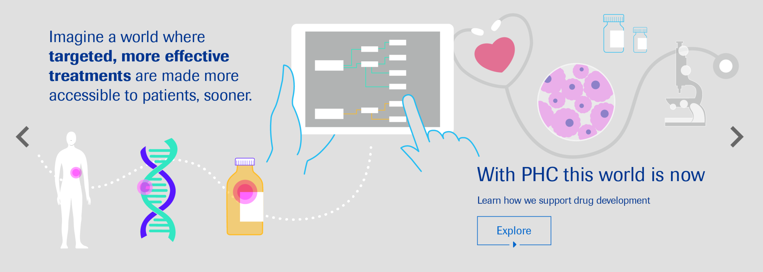
This gallery shows some MVP screens designed for the PHC website. It also includes illustrations developed to help communicate the core values of Personalized Healthcare to Roche employees, no matter what department or tenure.
Click on each image to zoom in and scroll through.


Research: competitive landscape
Our mission during the research phase was to find common threads in communication methods among institutions, organizations, and companies that were successful at building a strong community of learning and discovery through a refined language that worked for them.
Creates Value and Meaning
Addresses:
How are these things connected?
How to visually communicate “connection” consistently throughout the site?
How to visually signal: here is an opportunity for connection?
Visual Beacon + Vocabulary
Addresses:
How can I best utilize the information I have just received on the PHC site?
How to visually communicate “this is a call to action” consistently throughout the site, philosophically and literally?
How to visually signal: here is the next step after this?
Aligns with Brand Voice
Addresses:
Is this information coming from an expert source?
Is this information trustworthy?
As a Roche employee, what can I learn here?
How to visually communicate “medical” and “scientific”?


Style tiles
During the design and refinement phases we kept the core Roche visual guidelines clearly in our sight. We also used their amazing bank of photography to speak an established visual language. Here are concepts presented to the team from later/more refined stages of this design process.


